Julia Cameron popularized the idea of “morning papers,” suggesting that writing three pages of text about anything every morning would improve your creativity. I did this for a while but it was at a time of my life when I was writing for several hours of every day and it just became another job I had to do.
The idea of thinking about creativity every morning, though, makes a lot of sense. My sketching buddy Yvan starts his days by drawing something from his imagination and he recommends it highly. I don’t have any imagination so that is difficult for me.
Instead, I often get up, get a cup of coffee and play, watching YouTube videos, Craftsy courses, or maybe I’ll flip through an art book or three. And when I do these things I generally end up with a pointy device in my hand as I try to emulate some of the stuff I see.
This is a significant part of how I learn and improve (I hope) my sketching. The sketches I post on this blog aren’t about learning; they’re the result of using the skills I have to produce a sketch. While the sketches I create while learning aren’t much to look at, they are the real engine of my progress. Anyways, I was doing this sort of thing this morning and thought it might benefit some to pull the curtain back and talk about one aspect of my “process,” such that it is.
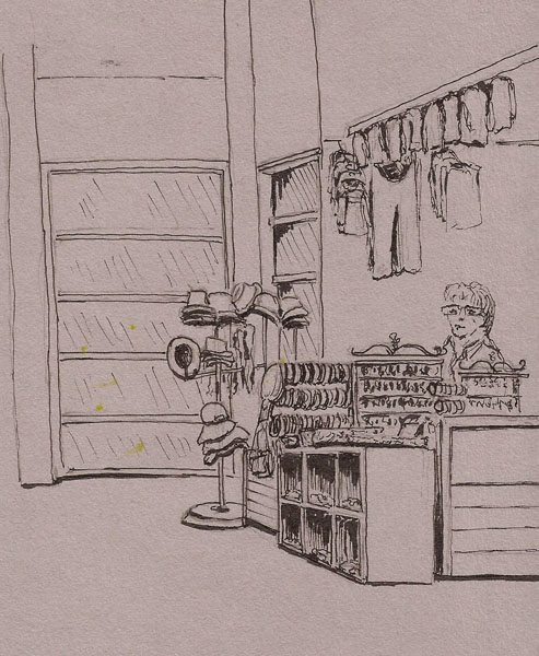
My buddy Yvan had sent me a sketch he’d done on the river and it caused me to pull up a photo of the scene I’d taken recently. I’m interested in doing larger scenes quickly so I grabbed a piece of photocopy paper and started scribbling. Here’s the result. Now I’ve got to go on site and draw it again.
 The smaller sketches at the bottom of this were to see how it might look with a gray ink (right) and a look at whether I could use watercolor on photocopy paper. Bad idea 🙂
 I’d found out that Anne-Laure Jacquet will be coming to Montreal and that I might get to meet her so I was re-watching a couple of her YouTube videos. One was a real time painting and about halfway through it I got the bright idea to try to replicate it. I’ve been wanting to start using a brush to draw and that’s what she was doing. Seemed reasonable to quickly try to draw her building. It wasn’t reasonable as it’s always better to work slowly with a new technique but this is also part of the freedom of not trying to create anything worth showing anyone 🙂
I didn’t have her exact colors but I grabbed a brush that seemed similar to hers and went to work. I should have used a smaller brush because I was working a lot smaller than she was on a 4×6 piece of watercolor paper. I only spent about five minutes trying this and I quickly learned that I needed to use a thicker mix of paint if I was going to draw with the brush. It was a very insightful five minutes and I will be doing more of this. I added a bit of linework just to satisfy my penchant for using a fountain pen.
 Last and certainly least was that I’d just gotten some Daniel Smith Bloodstone and Raw Umber Violet and wanted to try them. As I’ve mentioned, I have no imagination but I remembered a sketch Liz Steel did of some silos (I think) and how she’d used something dark between them to generate shadows and overall contrast. I had a 3×5 Calepino notepad on my desk and I quickly drew three little silos (sketch is only the size of a business card) and then played with my new colors between them. Not much of an exercise but I got to use my new colors and to once again be impressed with how much better Calepino paper is than Field Notes paper for such things 🙂
This morning session probably lasted an hour. I had two cups of coffee, watched a couple videos and got to try several things I wouldn’t do if I was out sketching with friends. Because I get to follow my whim during such sessions and because none of this stuff typically sees the light of day, I can cover a lot of new ground, trying things, failing at things, and trying again. These try fail cycles, I hope, will bend my visual cortex to my will and I’ll become better at this sketching thing we do.