Sketching At The Library

One of my many struggles as a sketcher is that I am slow, very slow.  I love to get into a subject and spent an hour or two sketching something.  But many times, I just don’t have that much time, or the scene I want to sketch is just too transient, or I’m with other people who don’t want to wait around for me to spend an hour sketching.

So, one of the things I vowed to do this winter was to work on my quick sketching abilities.  Quick sketching people is a good way to improve (develop?) those skills, of course, and it fits well with our harsh winters because I can be do it inside.  I went with Yvan, an amazing quick-sketcher, to our main library and we sat for a couple hours doing quick sketches, or in my case attempting to quick sketch people who were sitting/standing in the library.

2013-02-15QS1

Here is one of two spreads of these sketches that I did.  You can see some abject failures.  You can see evidence of where I started to sketch someone just as they got up and walked away.  You may also see a sketch or two that actually looks, kinda-sorta like a person.  At least I hope you do (grin).

Of course, being the building guy that I am, I couldn’t resist doing a quick sketch of a piece of the building across the street too.  Very quick and about as loose as I’ve ever tried to sketch a building.

2013-02-15QS2_1

All of the sketches were done in a Strathmore Series 400 ‘gray’ sketchbook using a Pilot Metropolitan (M) with Waterman Absolute Brown or a Lamy Safari (XF) with Private Reserve Velvet Black.  Both of these are washable inks and I used a waterbrush to create a bit of shading here and there.

It’s interesting to compare the Pilot Metropolitan, with its “medium” nib to my Lamy Safari “extra fine” nib.  The Metropolitan is finer, illustrating clearly the differences between Asian and European sizing nomenclature.  Between the museums and the library I continue to be a busy location sketcher in spite of the wind and cold outside.

Strathmore Series 400 “Toned Gray” sketchbooks

I’ve posted a couple examples of sketches I’ve done on Strathmore’s Series 400 gray drawing paper and it’s spawned a couple of questions about the sketchbook in particular but also the paper itself.  I’m really new to the paper and I’m not a paper guru, but I thought it might be useful for me to discuss my limited experience with these products.

Series400DrawingStrathmore’s Series 400 Drawing sketchbooks have been around for a very long time and most commonly found in various sizes of spiral-bound books with “Drawing” on the cover.  According to Strathmore they are and “ideal surface for any dry media, suitable for pen and ink.”  I’m not a pastel guy but I don’t think this paper would be useful for that medium but for pencil and pen and ink, it’s an excellent, inexpensive paper.  It may lack a bit in ‘tooth’ for those wanting to do detailed pencil sketches.

StrathmoreTonedGray
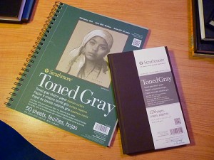
The recent release of this type of paper in both gray and brown is an important event in the sketching world, I think, and even more so because Strathmore has wisely produced brown-covered sketchbooks containing these papers.  I nearly went off the rails the first time I saw one of these beautiful sketchbooks.  I get bored by the typical black covers and the matt-brown finish of these sketchbook covers speaks to me.

The binding looks good but I don’t have enough experience with it to speak further about it.  I should also add that I have no experience with the brown paper version so my comments are limited to the gray paper.

2013-01-08Seminaire38thSketchcrawl

Done with Pilot Prera and Prismacolor white pencil

But I’m getting ahead of myself as I first discovered this paper in a spiral-bound 9×12 sketchbook.  These come with finely perforated pages so you can remove the papers cleanly.  I did exactly that and use this paper as individual sheets.  I found it very nice for pencil sketching, though I admit to know almost nothing about pencil sketching.  What I can tell you is that my buddy Yvan is a long-time and certainly excellent pencil driver and he said that “it’s great for ‘sketching’ (in quotes because his sketches are framing quality) but for portrait work the paper lacks tooth.”  Those of you who understand this can do your own interpretation.  Me, I’m still trying to figure out how to do basic shading with pencils.  I’m a pen and ink guy and so I provide the ink sketch on the left, done with Noodler’s Lexington Gray ink.

Series 400, done with Pilot Prera, Noodler's Lexington Gray ink

Series 400, done with Pilot Prera, Noodler’s Lexington Gray ink

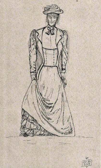
My understanding is that the hardbound sketchbooks are available in 5.5×8.5″ and 8.5×11.5″ sizes.   As I was in the market for a pen-only sketchbook that I could dedicate to learning how to draw people, I bought the smaller size.  I admit that I much prefer drawing buildings, cars and even fire hydrants rather than sketch people but it’s winter and there are more people indoors than there are buildings, so what’s a sketcher to do?

My new Strathmore sketchbook has become my “people” sketchbook.  Its 128 pages of gray, 80lb paper works well with the pens I use regularly (i.e. fine nib fountain pens).  I did find that if I use a medium nib and lay down a significant amount of ink there is slight feathering with my typical sketching ink (Noodler’s Lexington Gray) but it wasn’t objectionable.

Series 400, done with Pilot G-TEC-C3 hybrid ink pen

Series 400, done with Pilot G-TEC-C3 hybrid ink pen

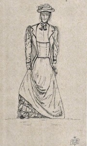
As I haven’t done much with the sketchbook yet I don’t have much to show in the way of examples so I’ll include the only two pages of my book that have ink on them.  The first is a set of scribbles I did of people parts.  There was no intention of anyone but me seeing this and no rhyme or reason to it so I apologize for its scattered nature.  The second sketch is my first attempt at sketching clothing folds with pen and ink.  Need to work on my darks a lot and proportions even more, but again, here it is.  This is a post about the paper, not this sketcher’s limited abilities (grin).  In any event, I hope this answers some of the questions about this paper and the new sketchbooks.

Oh…I should add, this paper contains too little sizing and is too light for use as a watercolor surface in my opinion.  I have done some experiments and I can get away with adding some shading using a Derwent Graphitone pencil and color with Faber-Castell watercolor pencils, moving both around with a small Sakura Koi waterbrush.  Trying to add a graded wash down the side of a building wall, however, is 1) very difficult as the paper is so absorptive and 2) the paper starts to pucker.  For myself, I’ll stick to my Stillman & Birn sketchbooks for all my color work.  They’re simply the best there is, though I wish I could buy them with brown covers.

Museum Sketching With Claudette

What’s going on?  Last week it was so cold that it was fashionable to run outside with a bucket of hot water, throw it up in the air and watch it turn instantly to snow.  Those -30C temps are tough so mostly we just stay indoors.  But this week, we’re 40-degrees warmer than that and it’s RAINING!   This doesn’t happen in Quebec, in February.  These temps, however, are much easier to take.

And so it was, yesterday, when I walked in the rain to the Musee de l’Amerique francais to meet up with a new sketching buddy, Claudette Gauvreau, a very talented sketcher.  I met her at our last sketchcrawl and we agreed meet at the museum for a sketching session.

2013_01-30ChapelOrgan700I got there about half an hour or so before our scheduled meet time and decided to sketch an organ that sits high above the floor of a chapel associated with the museum.  I always struggle with perspective when I have to look up this much and this case was no exception.  I started with pencil, drawing and redrawing the basic columns and the ceiling curves.  I even drew a big cube where the organ sits before turning to pen to do the actual sketch.

When Claudette arrived she needed to do some work in the chapel as well so I continued working and finished up the pen work.  I did it in a Stillman & Birn Alpha sketchbook using Pilot Prera and Metropolitan pens filled with Noodler’s Lexington Gray.  Shading was done with a Derwent Graphitone 8B pencil.  These pencils are great because once you hit them with a waterbrush they ‘set’ and you can put watercolor washes over it.

ClaudetteBalastradeClaudette finished up this great sketch of part of the railing around the main seating area, which holds a bunch of round banquet tables these days.  I can’t speak to materials used but isn’t it great?  The small bit at the bottom is an example of the flooring.

We headed into the museum where we sat in comfy sofas and sketched mannequins dressed in costumes used in movies and created by French costume designers.  She started sketching the cowboy character that Owen Wilson played in Night at the Museum, while I decided to do something I’d never done.  I sketched a Victorian dress using only a pen.  I’m fascinated by clothing folds and want to learn to draw them in ink.

2013_01-30VictorianDress700Anyways, in the time it took me to do this sketch, Claudette finished drawing her cowboy, then drew a security guard and an indian from the same movie.  Then she wandered off to look at the exhibits while I finished up my single figure.  Have I mentioned that I’m slow at sketching (grin)?  This sketch was done with a Pilot G-TEC-C3, hybrid ink pen on Strathmore Series 400 toned gray paper (5.5×8.5).  I wish I could show you Claudette’s sketches but I didn’t think to take a photo.

Next Wednesday, we’re meeting at the Musee de la Civilisation.  Want to join us?

Sketching On Toned Paper

I’m no expert to artist materials.  Most of the time when I talk about using them the discourse begins with me saying “This is the first time that…”  This is almost true of my use of toned paper in my sketching activities.  During last summer I made a small sketchbook from toned paper (Canson Mi-Teintes) and I did a few pen sketches in it.  Unfortunately, the sketchbook itself wasn’t stiff enough (thin covers) to work well as a sketchbook to use on location while I held it in my hand.

Now that it’s winter and very cold here, I’ve been working a lot in museums.  This shift in location and subject matter has been coupled by me doing some experimenting with different tools and materials and recently I’ve done a couple sketches on single sheets of gray, toned paper and I thought I’d share them here.

2013-01-15Nigeria6_700The first was done at the Musée de la Civilisation, in a large Nigeria exhibit that features lots of masks and headdresses used in ceremonies.  This one was done in Canson Mi-Teintes paper.  As I am also trying to learn how to use a pencil as a sketching medium, I used the smooth side of this paper and it worked well.  Not being a pencil guru, I started layout with a 3H pencil and ultimately ended up with an HB mechanical pencil.  Nothing special here and, I’m sure, most pencil experts will probably cringe that I didn’t use softer pencils.  I added a bit of highlight using a Prismacolor white pencil but I was fairly tentative in this as I’ve never done that before at all.  Still, the results ended up better than I expected.

The next sketch I did was done during our 38th Worldwide Sketchcrawl, which we did at the Musée de Francais and its associated chapel.  The chapel has been ‘secularized’ and is rented out for meetings and banquets.  Still, its walls are still adorned with statues of saints, the windows are stained glass, and a huge alter remains.

2013-01-08Seminaire38thSketchcrawl700But I love to sketch buildings and being driven indoors by snow and cold is frustrating.  I took advantage of the sketchcrawl to set my tripod stool in front of a huge window that looked out on a courtyard that was bordered by a very long, probably 150+ feet long building.  Rather than capture the entire structure, I decided to concentrate on a slice of it and I came up with this sketch.

This sketch was done on Strathmore Series 400 “toned gray” paper.  I bought a 9×12 spiral sketchbook of this stuff.  The sheets are perforated and can be easily separated from the sketchbook.  I did the linework with a Pilot Prera filled with Noodler’s Lexington Gray ink.  The suggestion of snow was added using the same Prismacolor pencil I used in the first sketch.  I like this paper a lot.  It’s much cheaper than the Canson paper and it’s a great pencil paper.  I felt that it was a bit too absorptive for ink, though.  A heavy line tends to feather a bit.

I really like drawing on toned paper.  I’m less wild about using single sheets of paper for my sketching and wish Stillman & Birn would create a gray version of its Epsilon sketchbooks.  A sketcher has to have a dream (grin).