In my last post I described my modular system for location sketching. I want to emphasize that there’s nothing unique about how I approach moving art materials to and from location sites and neither is there anything “best” about it. It’s just what I do, so this is more of a “just the facts ma’am” report than a “Look what I invented” thing. Here I continue the discussion by describing the three tool modules I mentioned in that first post.
Paint Module
 This module holds all my paint stuff, or rather the paint stuff I take on location with me. Home seems to overflow with palettes, brushes and tubes of color. Why is a question more for a psychiatrist than myself. Anyway, the case itself is a Lihit Lab Teffa Pen Case, or so says Jet Pens. This is the second one I’ve owned. I lost the first one, along with two nice Escoda Kolinsky travel brushes somewhere between here and there on Black Tuesday, at least that’s how I refer to it.
This case is mostly empty so for those who carry a lot of brushes and paint, there’s plenty of room for more. I try to keep my paint kit simple because that matches my understanding of paint. Here are the contents of this module:
 From left to right: 30ml Nalgene water bottle, squirt bottle, messy paint kit, Rosemary pointed-round Kolinsky brushes (#6 & #19), waterbrush, small brush used when I want to do something that’s hard on brushes.
A few words on this kit. First, the water doesn’t typically reside in this module, though it’s easy enough to include a bottle in the case. But as I mentioned in Part 1 of this treatise, I carry water bottles like this in each of my bags. I stole this bottle idea from Marc Taro Holmes and love it because it’s easy to carry a couple of them, exchanging a dirty one for a clean one when necessary.
The squirt bottle is indispensible. I love my Kolinsky brushes but they’re expensive and scrubbing them around to pick up pigment off dried cakes of watercolor isn’t my idea of a good use for them. But if I wet those cakes, and rewet them occasionally as I paint, it’s easy to pick up paint and a more saturated paint it will be. I think this is good, at least it works for me.
The paints are all Daniel Smith watercolors. Expensive yes, but I have a hard enough time with paint; I don’t need to be handicapped by cheap paint. When I started out I tried several cheaper paints. I thought it normal that my watercolors were all light and washed out. Then I bought some Winsor & Newton paint, real Winsor & Newton paint, not their Cotman line of student-grade paints. The difference was startling, even to someone like me. I have found that Daniel Smith paints rewet better than do W&N paints, which is why I now use them. This is not an endorsement as, to quote Sgt Shultz from Hogan’s Heros, “I know nothing” when it comes to paint.
Rosemary travel brushes: Wow…I love these brushes. I have limited experience with brushes I suppose. When I started I was determined to use good quality and so I bought a couple W&N Kolinsky brushes. I’ve mentioned the Escoda Kolinskys that I lost. Those were replaced by a couple of their Escoda Versatile travel brushes (synthetic) that are ok but just not the same as sable. I also own several Silver Black Velvet brushes which are a blend of squirrel and synthetic fibres. These are very nice and I use them when I’m at home.
The Rosemary travel brushes shown above are, as my dad used to say, the cat’s meow. I also like their short dagger brushes (#772) that Liz Steel loves but I’m more clumsy than normal when I try to use them. That’s all I’m going to say about brushes because there are better, more knowledgable people to listen to when it comes to all things watercolor.
Pencil Module
The case is from Global Art. They sell this case as a single and double-layer case but I keep my pencil selection to a minimum and thus use the single-layer case. Mostly I’ve followed Cathy Johnson’s list of watercolor pencils and I limit myself to 3-4 graphite pencils (Tombow Mono 100).
My watercolor pencils are Faber-Castell Albrect-Durer, mostly because I can completely solubilize the line they produce allowing me to use them to replace watercolors when I’m working small and particularly when I work in a place where water bottles and such are not allowed. I love working with them for everything but large washes but confess that I don’t use them as much as I once did. Not sure why. Notice that I carry a short waterbrush in this case. It works well in museums.
I should point out that I use the graphite pencils only if I’m going to do an actual pencil drawing, including rendering, which is rare. I’m a smeary kind of guy and always have trouble with that approach to drawing because of it.
Pen Module
This module is central to what I do. I’ve always said that I’m not an artist and that I just draw stuff and most of what I do is drawn with fountain pens. I just love them. I’ve used fountain pens since me and Alley Oop attended school together.
The case is one of those squeeze-to-open sunglass cases. It’s ideal because the metal squeeze mechanism allow pens to be clipped to the case on both sides. I cut a double layer of Bristol card that separates the two sides, keeping the pens from rubbing against one another. Note that I also sewed a couple half-rings to the case so I could have a shoulder strap. When on site I can hang this thing around my neck and my pens are always accessible.
Mechanical Pencils
I don’t “draw” with mechanical pencils but I do use them for organizing a drawing. During this stage of my drawing I’m concerned with proportions, locations, orientations of objects, not the actual objects themselves. In this way, when I pick up my pen, I know where the pieces are, what size they should be, and it gives me the freedom to concentrate on the drawing because the organization is already done. For this job I could use any old mechanical pencil but I love pointy devices and enjoy using good ones. I use a a Pentel Graph Gear 1000 (0.7mm) and a Pentel Kerry (0.5mm). The former has a retractable tip while the later can actually be capped, like a pen. Both are superb performers.
Fountain Pens
This is the most dynamic portion of my kit. I own a lot of pens and I like to play with them. The photo reflects what’s in the case right now.
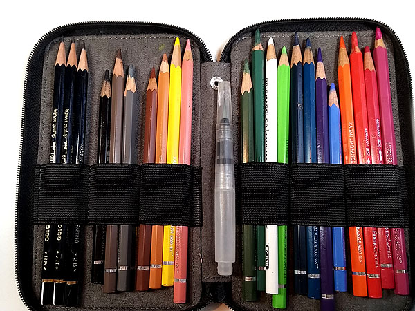
 From left to right: Duke 209 (fude), Pilot 78G F, Platinum 3776 SF, Pilot/Namiki Falcon EF
I guess this set of pens reflects several views I have about pens. The first is that a good cheap pen is as good as a good expensive pen, and I don’t buy pens costing more than $200, period. I think I paid $6 for the Duke 209 and the Pilot 78G was about the same. While I grumble a bit at the Duke 209 on occasion, the 78G works flawlessly. Yes, my ‘go to’ pens are the 3776 and Falcon but mostly because I love using them, not because they let me draw stuff any better.
Another thing this cadre of pens reflects is my approach to inks. You can’t talk about fountain pens without talking about ink. I’m lucky because I don’t get excited about drawing with colored inks and because I insist on my inks being able to withstand watercolors once they’re dried. This limits me to only a few inks on the market and most of them are black, or thereabouts. That said, drawing with dark, dark, black ink is sometimes useful, sometimes not so much so I mix it up a bit.
The Duke 209 is filled with DeAtramentis Document Black. I’m not the fan of fude pens that a lot of urban sketchers are and I confess that’s mostly because I’ve never been able to get use to them. I do like the Duke, however, because it’s very light. The black ink supports the fude role, where I can get fairly thin lines, but its real value is for creating shaded areas, thicker lines and more expressive sketches.
My Pilot 78G produces a very fine line and it’s filled with Noodler’s Lexington Gray. This produces a light line that is great when I want edges to be less pronounced and when I work very small.
My Platinum 3776 is filled with Platinum Carbon Black, still one of my favorite inks. It serves to provide me with a thin, black line and the gold soft nib gives me enough line variation to make me happy.
My Namiki/Pilot Falcon is filled with a mixture of Noodler’s Black, Noodlers Polar Brown, and water in equal proportions. This serves two purposes. It lets me use up the Noodlers inks, neither of which work for me by themselves and I end up with a brown-black that flows beautifully because of the addition of water. Another way I’ve gotten this sort of result is to mix DeAtramentis Document Brown, Document Black, and their Dilution solution.
Realize, however, that tomorrow this kit may have a Pilot Prera, Pilot Metropolitan, Platinum Plaisir, Platinum Carbon Pen, Kaweco Lilliput, or any number of Hero, Sailor, or even vintage pens. No, I don’t use Lamy pens, though I own a couple. No, I don’t use Noodler’s pens (I threw those away).
Misc. Pens
I carry a few specialty pens for special uses. These are:
 From Left to Right: Prismacolor fine brush pen, Uniball UM151 white gel pen, Kuretake brush pen
The Prismacolor pen is new to me. I bought it because someone mentioned that they liked them. I haven’t used it much but it does seem like it might be fun for quick-sketching when you want thick lines. I’m not a fan of nylon-tipped pens though.
The Uniball white pen is a staple when I’m working on toned paper. Nothing special here but I’ve found these to be more reliable than the Gelly-Roll equivalents.
The Kuretake #33 brush pen is one of my favorite tools, though it makes a fool out of me more often than not. For those who have used the Pentel ‘real brush’ pen, consider the Kuretake as a classy equivalent. It does have a real, soft, nylon brush and I can feed it with Platinum Carbon Black ink cartridges. It’s ideal for adding dark accents but these real brush pens will test your ability to control tip pressure. Marc Taro Holmes claims it was using these a lot that taught him how to draw directly with paint and I can believe it.
If your eyes haven’t glazed over by now you must be heavily caffeinated or a die-hard art stuff afficionado. In any case, I applaud you. Next time I’ll talk about paper, sketchbooks, and paper supports.