Patrick Ng presented one of his sketches by showing us all the stages of development in a series of posts in the Facebook group, Artist Journal Workshop. I thought that was a great idea and so I’m going to do that here. Click on the photo to get a larger image.
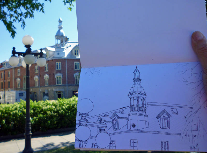 First stage occurred on a hot day, in front of the Quebec City train station. I decided to draw a building that sits at 363 Rue St. Paul, partly because it was a great subject and partly because there was a shady spot where I could sit. I didn’t quite get the drawing done in that first session as it still lacked the foliage, though that had been penciled in early in the process so I’d know what parts of the building would be covered by leaves.
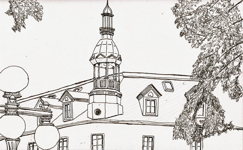
Once I finished adding the foliage and touching up a few of the details it looked like this. I did this at home.
I decided to add shading with early morning sun as I thought it would be better than the mid-day sun I had when I did the sketch. So, I went back to the site, plunked myself on my Walkstool and went to work.
 I now use a small chunk of 8B Derwent Graphitone pencil, stuck in a half-pan, for my basic shading. This has some interesting virtues. First, I can use it just like a cake of watercolor, using a brush to pick up pigment and mix up washes of any density I need. Second, it’s much smaller and lighter than the dilute india ink solutions I was carrying for this purpose. AND, the important thing is that once Graphitone been exposed to water and then dries, it won’t mix with watercolors I put over it. The end result of this stage sometimes causes me to wonder whether I need color at all. This may be because I’m not all that versed in or experienced with watercolor (grin).
 I like color, though, so I broke out my W&N watercolors and applied a moderate amount of color to the sketch.
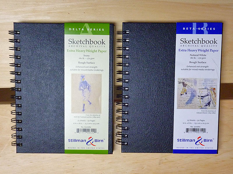
I used a Pilot Prera fountain pen with Noodler’s Lexington Gray ink to do this sketch. In my opinion, the techniques are made possible, or at least easier, because of the fantastic, double-sized papers of the Stillman & Birn sketchbooks I use. I can’t say enough good things about them. If you find these sorts of posts useful, let me know and I’ll do more of them.
Cheers — Larry

 As in every city, in Quebec City things occasionally catch on fire. And like other cities, we have a fire department and their facilities scattered around the city. And if you look at the fire engines that arrived at fires in the early part of the 20th Century they looked like this. Very cool and people now visit museums to see them.
 But today modern fire equipment are marvels of engineering, far more capable at quenching the flames. Far more expensive too but we spend the money because they do a better job. As a fire hydrant sketcher, I know there are some fire engine sketches in my future but it’s the fire houses that have caught my eye. I’ve seen several here that can only be described with a single word – KEWL!