Kaweco Lilliput – A Sketching Pen?

My new favorite store is Notabene, in Montreal.  I’ve talked about it before but today I want to show you a pen I bought there back when Liz Steel came to Montreal.  It’s the Kaweco Lilliput in aluminum.  You can buy it in brass and, I think, copper but the aluminum one is so light that I just had to go down that road as it suits my arthritic hands better.

To look at it though, you have to wonder whether such a tiny pen could be useful for sketching.  I’m here to suggest that it has both advantages and disadvantages as a sketching pen, but I’ll sort of give away the punch line by saying that I’ll probably be using this one a lot this winter.

Size

When it’s closed up, it’s really tiny, measuring only 95mm long and about 7mm in diameter.  Drop it in your pocket and you won’t even know it’s there, which can be good or bad depending on your view.

When open, however, it’s every bit as long as a Lamy Safari so you feel like you’re holding a real pen, which you are.

While the Safari weights 18g, the Lilliput weighs only half that (9g).  A feature I like as a street sketcher is the ability to post the cap and the Lilliput allows that like a champ since there are threads that let you screw the cap to the end of the pen.  Works great every time.

Ink storage

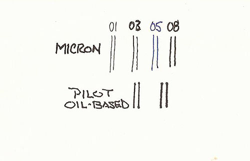
This is an area where pros and cons are dependent upon a person’s needs.  The Lilliput takes standard pen cartridges.  This translates directly to having a large number of inks available from a number of manufacturers.  Kaweco themselves make a bunch of them, including a really nice black and an equally nice gray that I’ve tried so far.  The downside of standard cartridges is that they hold less ink than, say Platinum or Pilot cartridges. Another downside of standard cartridges is that none of the truly waterproof inks come in that size cartridge, though aside from Platinum, that’s true for all of the cartridge formats on the market.

Kaweco makes a converter for this pen but by all accounts it’s a miserable design that doesn’t work well and actually holds less ink than do the cartridges.  I don’t find any of this a drawback as I can fill standard cartridges with any ink using a pen syringe, which is how I fill all of my pens anyway.

So how does it perform?

I bought the fine nib.  Kaweco also sells it with heavier nibs and even an extra-fine nib that is so fine that I didn’t see it as practical.  Here’s a quick comparison of Kaweco fine and a Lamy Safari extra-fine.  I tried hard to get this graphic to display in the size/contrast of the actual linework but I suspect it will display on most computer screens larger than it exists on paper.  Performance while inverted is excellent, by the way, and it doesn’t seem to dry up like many pens when used in this way.  You can see that Kaweco Fine nibs are fine, like most Asian fine nibs.

I started using this pen with a Kaweco Stormy Grey cartridge.  I decided that it wasn’t dark enough to make me happy so I switched to Kaweco Pearl Black.  Both of these inks performed well in the pen, though I noticed that the pen writes a bit drier than my Platinum and Pilot pens.

Then I filled a cartridge with Platinum Carbon Black.  This worked ok for a while but fairly quickly, the dry-writing fine nib and pigmented ink combination created some starting problems, though once started it seemed to work ok.  I really hate that, though, so I don’t find PCB a suitable ink for this pen.

I’ve tried my diluted version of DeAtramentis Document Black ink and that works great.  Just for this review, I ran some Noodlers Black through the pen.  This works fine too for those of you who find that ink suitable for sketching.

What I really like about the pen is the ability to start a sketch with very light, sometimes intermittent lines if I use a very light touch, and then, as the sketch develops, I can add emphasis and contrast by applying a bit of pressure.  Coupled with its light feel, it’s ideal for quick-sketching people.

So, is it a good sketching pen?  If you love big, heavy pens, absolutely not.  If you absolutely need to use Platinum Carbon Black rather than alternatives, I don’t think so.  If it’s going to be your only pen, probably not.  But this pen is now part of my arsenal because of its light weight and small size and because it opens into a full-size pen that feels good in my hand.  Here is a doodle page from my testing.

Pilot Oil-Based Drawing Pens

This is a just a quick note about the “new” (recently available on Jet Pens) Pilot oil-based drawing pens.  I bought the 01 and 03 versions of this pen as I was intrigued by the ‘oil-based’ approach.

PilotDrawingPen

I think it’s fair to say that the de facto standard in the nylon/felt drawing pen world is the Sakura Pigma Micron pen line and I’ll use them as a baseline because so many know these pens.

I must preface my comments with the realisation that most people don’t pay much attention to the actual sizes of tips of these pens and realize that a Micron 05 makes a thicker line than a Micron 03 but the actual thickness is not precisely indicated by those numbers.

So be it, but we also have expectations when it comes to this sort of labelling and expect that a Staedtler 03 won’t be too different from the Micron 03 in width.  That is the reason for this note.

PilotOil-BasedPensThis is displayed larger than life so that the line widths are easy to see.  I’ve left the Pilot pen lines unlabelled so that you can guess what I used to make them.  A hint can be found in my mention of which pens I bought 🙂

The thing is, these lines are from a Pilot 01 and 03 respectively.  You can see that they are much thicker than Micron lines labelled with the same numbers.  In fact, the Pilot 03 is so much thicker than a Micron 03 that it’s thicker than a Micron 08 as well.  This is no big deal if you know it to be the case before you buy but otherwise it comes as a big surprise.

Bobbing Around In The Sketching Doldrums

When I was a kid I was infatuated by the notion of pirate ships, the HMS Bounty and other sailing ships portrayed in movies getting caught in ‘the doldrums’, the area along the equator where prevailing winds are often very low.  Without wind power, these ships and their crews could flounder for days, waiting for some weather disruption that would give them enough wind to take them out of the area.

These days we talk about being ‘in the doldrums’ more figuratively but, for me and my sketching right now, my doldrums make me think of those movie scenes where the guys on the ship mournfully looked out at a dead calm sea, waiting for something to happen.

I know that spring is going to come ‘real soon’ and that while truly warm temperatures are still a couple months away, there will be some ‘tolerable’ days when I can get out on the streets and sketch.  But as I’ve become completely bored doing pencil renderings of white heads of Olympic gods, I’m bobbing up and down in my imaginary sketching ocean, anticipating the upcoming exodus from my house and onto the streets.

So I’ve been filling little sketchbooks with doodles, quick gestures of people on the streets and an occasional coffee house session.  They’re fun, they’re probably improving my hand-eye coordination, but they’re not much to look at so I won’t bore you with them.

But it’s been a while since I’ve posted so I’ll show you a sketch I did when I just HAD to go somewhere and sketch.  I was at the museum and decided to try something different.  If the subjects won’t change, change your approach to them, says me.  And so, rather than spending time blocking in proper proportions, I set a time limit of around half an hour, and started scribbling with my Pilot Falcon in my Stillman & Birn Alpha (10×7) sketchbook.  Direct with ink, pedal to the metal.  Would it look anything like Zeus’ head?  It actually took me a few minutes beyond my half-hour limit because I grabbed a waterbrush I had that’s filled with very dilute Lex Gray ink and, shazaam…a mediocre depiction of the head of Zeus, a head that’s had its nose broken off giving is a rather odd look.

Can we just have a bit of spring?  Pretty please.  With sugar on top?  I’ll be good.  Honest.  The doldrums aren’t as much fun as I imagined when I was a kid.Zeus sketch

De Atramentis Document Ink: Creating A Grey

The new De Atramentis Document inks (not to be confused with other De Atramentis inks) are a dream come true for those of us who sketch with fountain pens and want waterproof inks.  Before they came along, color choices could be described pretty much like Henry Ford described color selection for the Model T Ford – “any color as long as it’s black.”

The current elephant in the room question is whether we’re going to have a ready supply of these inks over time.  De Atramentis is a one-man operation and Goulet Pens, to my knowledge, is the only source for them in North America. Their last shipment came in and went out before some people had a chance to even see them show up.  Brian has said their current order is very large.  I hope so.

I was one of the lucky ones.  I’ve had De Atramentis Document Black and Brown for a while now and was able to fill in the other colors during the few hours they were available at Goulet Pens.

The potential to create any color I want now exists, except for one thing.  De Atramentis sells a solvent for their inks and proper dilution should be done with that solvent.  These inks are pigmented inks and every ink have a particular chemistry to give them the flow and paper interaction properties of a particular brand of ink.   The proper solvent should be used to provide the proper lubricant, stabilizer, and maybe anti-fungal agent in their proper proportions.  The big deal here is the lubricant as this generates proper flow through the pen.  Too much lubrication and you can get feathering, nib creap, and slow-to-dry inks.  Too little and you can get a dry-writing ink, though it may actually dry more quickly.

So before I continue, there’s my caveat.  If you fear doing anything that might be referred to as an “experiment”, read no further.  This is an experiment.  I’ve mixed up a grey ink using the brown and blue ink in this line.  It creates a very dark grey, not unlike Noodler’s Lexington Gray  but a bit darker.  I wanted to lighten it up, but the solvent isn’t available to me, so I used water.  Worse still, throwing caution to the wind, I used plain old tap water to thin the ink.  Here’s what I mixed:

De Atramentis Document inks, not to be confused with other De Atramentis inks:

Brown:  3 parts
Black:    2 parts
water:    3 parts

That works out to 60% water, which is a lot but I found that when thinning other inks I had to add a considerable amount of water to lighten their color.  This proved true for the De Atramentis Document inks as well, maybe even to a greater degree.

grey

grey2As you can see, I got a decent dark grey.   I may want to play a bit with the blue/brown mix or maybe try a green/red mix but this is just about what I want on a tonal scale.  Just enough to take the harsh black edge off my sketches.

The real point of the experiment, though, was to see how diluting with water would work.  I’m surprised to say that even with this extreme dilution, the ink holds up nicely.  There is no feathering, the line remains consistent and there are no flow problems with the Pilot Prera (fine nib) that I used to dispense it.  I wanted the sketch to reflect the tonal differences between the black and gray lines so I used De Atramentis Black to do all the shadow lines on the right side of the bottle.  After scanning I quickly slopped watercolor all over it and can report that the waterproof nature of the ink is retained.  All of this is being done on cheap sketchbook paper.  Just to ensure that it wasn’t the result of the paper, I did a bunch of scribbles on Stillman & Birn Alpha series paper and those were were waterproof as well.

By the way, there’s been some discussion of a Fog Gray color being added to the De Atramentis line.  Those few who have had access to it have found that it’s really more of a grey blue than a true grey.   Given that it’s easy to mix our own greys, though, it hardly matters.

For me, the experiment was a great success.  To be honest I’m still a bit surprised because in my experience, dilution of pigment-based products (wood stains I’ve used) with water are very limited and things tend to fall apart once you get past 10-15%.  Here I’ve more than doubled the volume of ink with water..and it still works.  Go figure.  I still wish I could get access to De Atramentis solvent but until that time…I’m going to go draw a few shades of grey.

People In Motion by Marc Taro Holmes

I’m a big fan of Marc Taro Holmes.  His precise and yet loose (how does he do that?) building drawings are a wonder to behold, at least for this street sketcher.  Marc works larger than I do, looser than I do, and a whole lot better than I do but I can’t get enough of his work.

His recent book, Urban Sketcher: Techniques for Seeing and Drawing on Location rests next to my butt location when I watch TV and while I’ve read it twice, I find myself flipping through it, studying the drawings, as my wife and I watch…yawn…American Idol.

15jan26_craftsyscreenshots_15c

But what I’m not, however, is a sketcher who searches out people to draw, attends life drawing classes, and the rest.  Sorry folks, but I find people boring.  Buildings are just cooler.  That said, when Marc, in conjunction with Craftsy, offered a course titled People in Motion I immediately signed up.  I was going to get to see Marc draw…yippee!

I’m really glad I did.  Marc is not only a great artist/sketcher, he’s a well-organized, articulate teacher with a willingness to provide lots of information in high-density form, showing you every step of his approach to drawing people.  People or xylophones, what Marc teaches in this class will help you draw them quicker and better.

He provides several ways of doing it but his primary method is a four-part approach.  I suspect that more often than not, Marc himself smushes the four parts together when he’s on the street sketching, but for learning what he’s thinking as he captures people dividing up the thought processes and results of them on paper, is an ideal way to get the points across.  And you know what?  Marc has even got me, yeah…go figure, ME interested in drawing people.

I encourage anyone who would like to capture ANYTHING quickly onto paper, to at least view the intro video of this course.  Better, just take the course.  It’ll be money well spent.