Sketching Ain’t Easy These Days

It’s now 2018 and I’m hoping there will be fewer doctor and physio appointments this year.  I’ve tried to doodle my way through the last few months of 2017, working on using my elbow and shoulder more and my wrists less.  I draw small, though and find that transition to be tough sledding, particularly for drawing small-size curves that my wrist just won’t do.

Nevertheless, if I made any resolution for 2018 it was to get back to drawing.  This morning I decided to draw a scene from a photo.  My wrist was feeling “pretty good” which is my shorthand term for “it’s not locked up and doesn’t hurt constantly” and so I grabbed a Platinum Carbon pen and a 5×7 piece of Fabriano Artistico CP and tried to capture a photo I had of Quebec’s Finance Building.  The pen isn’t flowing like it once did, probably because I’m being too careful about how I’m moving my hand, but I did produce a sketch and I share it with you here.

Hopefully things will improve as I get back into it.  I sure hope so because Liz Steel’s new watercolour course starts January 10th and I hope to do a lot of fuzzy stick practice ‘real soon.’

Location Sketching Equipment – Larry Style, Part 3

I’ve talked about how I carry my stuff and what pointy devices I use.   What remains to be discussed are the substrates and supports for them, or more simply paper.  My early thought was to discuss how I make my choices, but quickly that idea became more book-size than blog-size and so I’m limiting this to a more simple presentation of what I use.  Maybe, in the future, discussions of why can take place.

Sketchbooks

I like to have several sizes of sketchbooks available to me but this conflicts with my desire to not have too many of them ‘in progress’ at the same time so sketchbook management is a constant struggle.

This photo represents the size variation I like.  The large one in the back is a Stillman & Birn 8×10 Beta, the small red one is a Field Notes notebook, the landscape 9×6 is Stillman & Birn Alpha, and the other one is a 4×6 book, also from Field Notes.

Single Sheets

When it comes to convenience at the drawing stage, there is nothing better than working with single sheets as it allows me to switch paper types and sizes, work without the constraints of sketchbook covers, and single sheets are very light.  This approach is less useful when you want to hand a sketchbook to someone who comes up to you on the street and is interested in what you do.

My approach to using single sheets takes two forms.  The first is to use a magnet board.  The base of mine is very thin plywood and the metal surface came from a small magnetic board sold at the dollar store.  All I did was remove the frame from the dollar store board and glue the metal sheet, with contact cement, to the wood.  I rounded the corners to make it easier to slide in/out of my bag.  The magnets are rare earth magnets.  This approach allows me to quickly attach any paper and, because it’s very light, it’s easier to hold than any sketchbook.  It has the added advantage that I can attach my palette to it with magnets too.

The other way I use single sheets is an idea from Marc Taro Holmes and one I use when I want to use first-class watercolor paper (Fabriano Artistico).  I take sheets and tape them to Coroplast, sometimes on both sides.  Coroplast is so light that I can carry 3-4 sheets without any appreciable weight added to my bag and they’re a dream to work on because they are so light.

Both of these approaches are great for sketching while standing because there’s no weight involved or pages to have to clip to keep them from blowing in the wind.

This brings me to the end of this series.  I do have a sense that I’ve left a lot out of the discussion by not spending time talking about why I use what I use so if you have questions, feel free to ask.  I hope you’ve enjoyed this brief look into location sketching – Larry style.


Sketching Without A Net

I’m used to working with the subject in front of me.  I rely upon it to provide me with proportions and relationships.  When I leave that world and rely only upon my imagination, I feel lost, needing something to grab onto that is simply not there.

This morning I sat down with a piece of hot-press watercolor paper.  I’m trying to figure out how to use it so I thought I’d doodle a bit.  This sketch started with an eye.  Then I added some hairs around it.  This led to the addition of a nose and I was off in never-never-land, trying to figure out how to draw a mouse.

I don’t know how to draw a mouse.  I’m sure I got the proportions wrong but my serendipitous road took me to needing a mouse all scrunched up while trying to hold onto something.  Where are a mouse’s feet anyways?  I don’t really know.  I was just doodling.  Anyways, here it is.  Mice, even poorly proportioned mice are cute.

My buddy Yvan has told me that I needed to spend more time drawing from imagination.  According to him, if you do this you will never look at the world the same because you’ll always be building a vocabulary so you can draw from imagination.  I think he’s right.  I need to go look at some mice.

A Little Shed By The Bay

As a street sketcher, I’m used to coming to these blog posts with stories about where I went, what I saw, and why I drew what I drew.  What do studio artists talk about anyways?

Here’s a little sketch from my imagination.  I spent a few minutes trying out some Fabriano Artistico hot-press paper.  Watercolor acts very differently than on cold-press paper and It’ll take a while to figure out how to use it.

The Road To Waterproof Brown Inks For Sketching

Recently I wrote about the new Platinum gall inks and noted that they aren’t waterproof in the way that watercolorists need them to be waterproof.  They’re more like the Noodler’s “bulletproof” claim of water resistance.  You couldn’t remove a signature from a check, but the color bleeds when these inks are used on good watercolor paper.  The reasons may be different for Noodler’s vs Platinum gall inks but the results are the same.

Many of us have spent a lot of money trying to find a truly waterproof brown ink we can shove through our fountain pens.  Heck, I spent $30 on the Platinum ink even after I’d found a really good solution just because I was curious.  Anyways, my post on the Platinum inks resulted in some discussion and I thought I’d tell you about my solution.

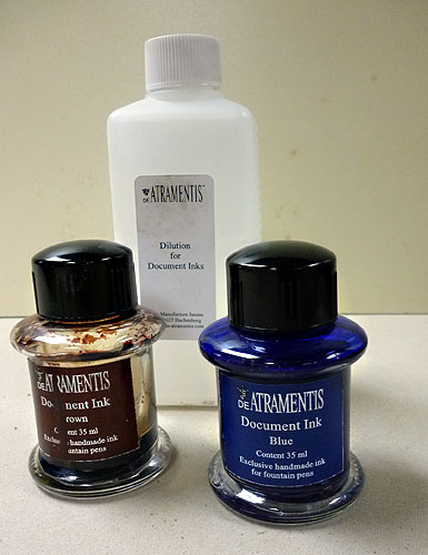
Jane Blundell did an extensive analysis of the DeAtramentis Document inks where she mixed entire color wheels with these inks.  They are all quite waterproof and fountain pen friendly.  Making matters even better for the in mixer, DeAtramentis sells a “dilution solution” which is just like the ink but without the pigment.  I use Document Black, diluted 5:1 (dilution:ink) to generate a dark gray that’s similar in color to Noodler’s Lexington Gray but is more waterproof and its lower contrast to white paper works better when you’re going to use watercolors on your drawings.

DeAtramentis Document Brown leans towards red, pretty close to a burnt sienna color.  It works well as a sketching color but on white paper, just like black ink, its contrast is very high.  I’ve tried just diluting it and that works but, to my eye, it accentuates the red component of the ink and I’ve never liked that very much.  So, what to do.

Mix a bit of blue with it, that’s what.  Just like mixing ultramarine blue to burnt sienna, if you mix in enough blue you get gray.  But if I add only a few drops of blue, I get a nice, walnut brown that works really well for me.  I’m not going to tell you how many drops or anything like that.  Achieving the color YOU want will require a bit of trial and error on your part.  Personally, I don’t worry about too much.  I mix small quantities, and test with a dip pen until I get the color I want.  The next time I might get a slightly different color.  I don’t really care because my goal is to tone down the contrast of the ink with the paper, not achieve some particular color.

To the cost of this adventure.  A bottle of Document Brown (35ml) will cost you around $20 and the dilution solution (250ml) is another $20.  That’s pretty expensive but, depending upon how much of the dilution solution you use, you also end up with a lot of ink.  Adding another $20 for a bottle of blue really boosts the price and I’d recommend just buying a sample unless you plan on drawing with blue.  It doesn’t take much to achieve the shift shown above.

Finally, here’s a drawing I started on one of the few outdoor sketching days we’ve had thus far.  Watercolor will come but for now you can see the results of my “walnut” ink.  I think the contrast here is a bit more in the scan than on paper.

Fabriano Artistico (9×12), Pilot Falcon, DeAtramentis Document Brown + blue