Sketching In A Baron Fig Apprentice Notebook

One of the highlights of this otherwise miserable winter was taking Marc Taro Holme’s People in Motion class.  During the class Marc suggests that you get a small, cheap notebook and sketch in it constantly.  He recommends the Moleskine Cahier (same paper as the Moleskine notebooks but without the hard cover).

I think the idea of a small, cheap notebook that facilitates sketching everywhere and all the time is a great one.  On recommendation from my mentor and buddy, Yvan Breton, I’ve been doing this for a couple years and it’s done more for my ability to draw than anything else I do.

What I hadn’t tried was the Moleskine Cahier so I bought some.  They come in a 3-pack for about $12 around here.  I was very disappointed because of bleed-through and lots of ghosting when I used my fountain pens.  I complained about this here, and included a bunch of sketches to illustrate the problems.

But what I really did like about these little books was how small they were.  My typical small book has a hard cover and 96 cheap-paper pages.  These books are 5.5 x 3.5 x 0.5″ while the Cahiers are only 48 pages with a thick paper cover and are thus about 1/8″ thick.  Very portable, very light in the hand.  If only….

There are alternatives and I’ve been trying them.  Tina Koyama motivated me to try Baron Fig‘s notebooks, and I think I might be falling in love with their little Apprentice notebooks.

While the typical small notebook is 3.5″ x 5.5″, the Baron Fig is 3.5″ x 5″.  When I received them this threw me off a bit as I was more used to the other size but now that I’ve used it a bit I find that I actually prefer it.  It fits my hand better and certainly fits in a pocket more easily.  Size does matter.

Baron Fig

The books are 48-pages of white (an improvement over Moleskine) paper and cardstock cover.  They are stitch-bound rather than stapled like most of their competition.  It’s a nice touch and the stitching is perfect.

While they can be had with lines, grid or blank paper, I bought a pack of their standard gray notebooks (3 per pack) and a pack of their “limited edition” Time Travel series.  They cost only $10 per pack so, $3.33 per notebook.  Not bad even if you do use a lot of them.

All this is great but the proof is in how they handle ink.  For me that means fountain pen ink.  Typically I use fine nib pens in my small notebooks because of the small format and a side benefit is that it places lower demands on the paper when it comes to bleed-through and ghosting.

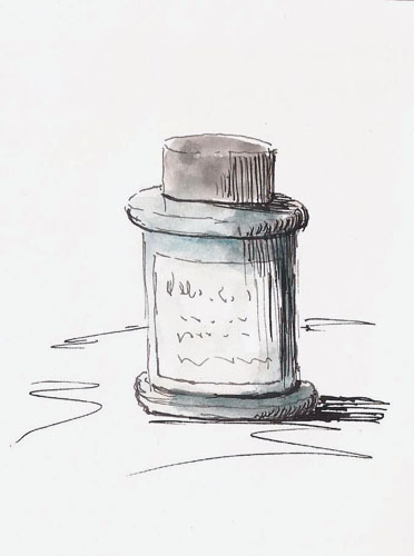
But what happens if you do use a lot of ink on Baron Fig paper?  The results are better than I thought.  I decided to try Tina Koyama’s favorite pen, the Sailor Fude pen.  This pen can lay down a lot of ink or a little ink depending on the nib angle.  Here’s the result of this experiment.

2015-02-18library1

Baron Fig Apprentice, Sailor Fude pen, De Atramentis Document Black

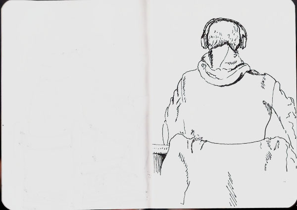
Of course the “proof in the puddin” is to look at the back of this sketch.  Here it is (on the left):

2015-02-18library2

As you can see, there is some ghosting but not much in the way of bleed-through.  We’re not talking about doing drawings that you’re going to frame so, to me, this is acceptable.  The sketch on the right was done with a Namiki Falcon SEF.  This is my typical nib size for these and the ghosting on the back of this sketch is negligible.

But what if you wanted to use the Sailor pen and also wanted to draw on that ghosted page?  Could you do it?  Sure, the ghosting wouldn’t distract from your sketching.  It might, however, not look as nice as you’d like when you scanned it to send it to your favorite social media group.  But, with the magic of Photoshop (or some other graphics program), you can easily remove this ghosting so that it looks like this:

2015-02-18library2.1

These results are the same as I’ve gotten from the paper in my cheap hardcover books so I’m thrilled and the paper in the Baron Fig as it looks better and feels better.

My cheap book sketches rarely see any color, simply because I’m generating lots of sketches as I wander through my day and so there’s no time for color.  But, for this post I decided to add a bit of color to see how that worked.  I kept the washes light and didn’t expect to move them around much.  I was surprised at how well it worked.

2015-02-18library3

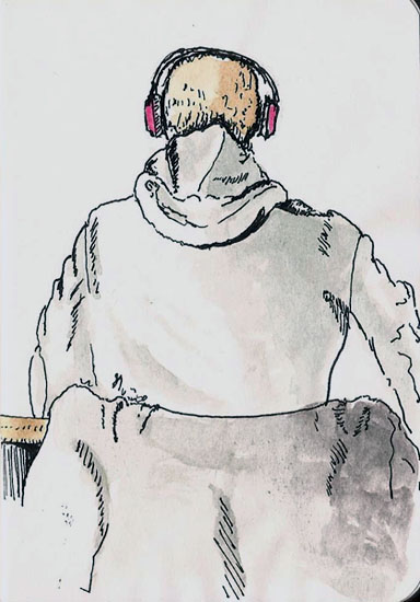
Baron Fig Apprentice, Namiki Falcon, De Atramentis Document Black

This is definitely not watercolor paper but I was happy with the results.  This does increase the ghosting a little bit but surprisingly little, as long as you wait for the paper to dry.  This definitely opens the door for me to use my gray and brown waterbrushes to shade drawings on the fly.  If you’re looking for a small, very portable, sketchbook solution, the Baron Fig Apprentice might be what you need.


Sometimes Sketching Isn’t About The Sketching

My daughter is home from school for a week and I got a late start as I headed to the museum to do some sketching.  By the time I got there it was nearly 11AM and I found that three of my friends had been there since opening time.  Two of them I hadn’t seen in quite a while so we spent some time ‘catching up.’  Ultimately we decided to meet in the cafeteria for some of their divine cremed turnip soup.  And so it was when I headed off to find something to draw.

Then I realized that soup time was only 25 minutes away.  Hmmm…  Rather than starting a long pencil drawing of one of the statues I decided to whip out the Namiki Falcon and use it to do a simple sketch of one of the glass cabinets and their contents.  These things are two huge sheets of glass set parallel to one another with a table inside.  The area above the table is encased in a big glass box.  Easy peasy, says I.  By the end my eyes had crossed trying to follow transparent sheets of glass inside of sheets of glass.  It was fun though.  The soup and company were better.  Sometimes sketching isn’t about the sketching.

Stillman & BIrn Alpha (10x7), Namiki Falcon, De Atramentis Document Black, Pentel brush  pen with Platinum Carbon ink

Stillman & BIrn Alpha (10×7), Namiki Falcon, De Atramentis Document Black, Pentel brush pen with Platinum Carbon ink

Hibernation’s Hidden Costs

It’s currently -13F outside.  This, they say, is a ‘warming trend’ and in reality it is warmer than it was just a few days ago.  But from the perspective of a street sketcher, it matters little whether it’s -13 or -30 outside, I stay inside.

Mid-winter depression is a real phenomenon in places like Quebec, where I live, but for me, it’s more like cabin fever.  I spend too much time looking out the windows, wishing for a place to sketch.  In previous years our Museum of Civilisation has been that place and the displays there have kept me busy throughout our long winters.

But this year, half of the museum is closed due to a fire that occurred just as winter was starting and what’s left are displays of early animation where you can watch endless series of cartoons and the Olympus exhibit which is filled with lots and lots and lots of plaster statues of Zeus, Aphrodite and their kin.
Sketching them was fun at the outset but I truly am a street sketcher that likes drawing buildings.  Yet another plaster head is just not cutting it anymore and so my sketching is floundering somewhat these days.  I doodle a lot but it’s just not the same.  So, I decided to draw a window.  It was just one lowly window, drawn in a 3×5 sketchbook, but it sure felt good (grin).

2015-02-06window

Moleskine watercolor notebook, Namiki Falcon, De Atramentis Document Black ink


My Sketching Brakes Are Ineffective

Recently I’ve been on a quick-sketching binge.  Everything I look at got scribbled onto paper in a minute or two.  That’s a lot of fun and, I feel, it helps me “see” shapes and their relationships more quickly.  But it’s sort of like eating a steady diet of Twinkies.  You might even like Twinkies but at some point you’re going to want an apple.  I needed an apple.

I stopped to pick up a pound of coffee at a local coffee roastery.  I decided to sit and draw so I also bought a coffee as an excuse to inhabit one of their chairs.  I sat on a high chair near a window and two guys sat down near me, below my eye level, and I saw an opportunity to ‘know’ that my subject would be there for a while.  I started sketching with the idea that I would have ample opportunity to truly capture their essence.

Have you ever gotten off the freeway and had a hard time driving as slowly at the side street speed limits require?  That’s how I felt.  I started blocking out the sketch with some well-placed dots and then found myself scribbling details.  I tried to slow down but my quick-sketching brain just wouldn’t let go.  This was a constant struggle throughout the process.  The result was a sketch that wasn’t quite a quick-sketch but not what I was really trying to accomplish.  I think I have to get my sketching brakes checked.  Oh…and how do you draw shaved heads?

Stillman & Birn Alpha (10x7), Pilot Falcon, DeAtramentis Document Black, Pentel brush pen

Stillman & Birn Alpha (10×7), Pilot Falcon, DeAtramentis Document Black, Pentel brush pen

De Atramentis Document Ink: Creating A Grey

The new De Atramentis Document inks (not to be confused with other De Atramentis inks) are a dream come true for those of us who sketch with fountain pens and want waterproof inks.  Before they came along, color choices could be described pretty much like Henry Ford described color selection for the Model T Ford – “any color as long as it’s black.”

The current elephant in the room question is whether we’re going to have a ready supply of these inks over time.  De Atramentis is a one-man operation and Goulet Pens, to my knowledge, is the only source for them in North America. Their last shipment came in and went out before some people had a chance to even see them show up.  Brian has said their current order is very large.  I hope so.

I was one of the lucky ones.  I’ve had De Atramentis Document Black and Brown for a while now and was able to fill in the other colors during the few hours they were available at Goulet Pens.

The potential to create any color I want now exists, except for one thing.  De Atramentis sells a solvent for their inks and proper dilution should be done with that solvent.  These inks are pigmented inks and every ink have a particular chemistry to give them the flow and paper interaction properties of a particular brand of ink.   The proper solvent should be used to provide the proper lubricant, stabilizer, and maybe anti-fungal agent in their proper proportions.  The big deal here is the lubricant as this generates proper flow through the pen.  Too much lubrication and you can get feathering, nib creap, and slow-to-dry inks.  Too little and you can get a dry-writing ink, though it may actually dry more quickly.

So before I continue, there’s my caveat.  If you fear doing anything that might be referred to as an “experiment”, read no further.  This is an experiment.  I’ve mixed up a grey ink using the brown and blue ink in this line.  It creates a very dark grey, not unlike Noodler’s Lexington Gray  but a bit darker.  I wanted to lighten it up, but the solvent isn’t available to me, so I used water.  Worse still, throwing caution to the wind, I used plain old tap water to thin the ink.  Here’s what I mixed:

De Atramentis Document inks, not to be confused with other De Atramentis inks:

Brown:  3 parts
Black:    2 parts
water:    3 parts

That works out to 60% water, which is a lot but I found that when thinning other inks I had to add a considerable amount of water to lighten their color.  This proved true for the De Atramentis Document inks as well, maybe even to a greater degree.

grey

grey2As you can see, I got a decent dark grey.   I may want to play a bit with the blue/brown mix or maybe try a green/red mix but this is just about what I want on a tonal scale.  Just enough to take the harsh black edge off my sketches.

The real point of the experiment, though, was to see how diluting with water would work.  I’m surprised to say that even with this extreme dilution, the ink holds up nicely.  There is no feathering, the line remains consistent and there are no flow problems with the Pilot Prera (fine nib) that I used to dispense it.  I wanted the sketch to reflect the tonal differences between the black and gray lines so I used De Atramentis Black to do all the shadow lines on the right side of the bottle.  After scanning I quickly slopped watercolor all over it and can report that the waterproof nature of the ink is retained.  All of this is being done on cheap sketchbook paper.  Just to ensure that it wasn’t the result of the paper, I did a bunch of scribbles on Stillman & Birn Alpha series paper and those were were waterproof as well.

By the way, there’s been some discussion of a Fog Gray color being added to the De Atramentis line.  Those few who have had access to it have found that it’s really more of a grey blue than a true grey.   Given that it’s easy to mix our own greys, though, it hardly matters.

For me, the experiment was a great success.  To be honest I’m still a bit surprised because in my experience, dilution of pigment-based products (wood stains I’ve used) with water are very limited and things tend to fall apart once you get past 10-15%.  Here I’ve more than doubled the volume of ink with water..and it still works.  Go figure.  I still wish I could get access to De Atramentis solvent but until that time…I’m going to go draw a few shades of grey.