 Not long ago I posted this decorative square and talked about how we’d started drawing these squares in a chapel. I also mentioned that I was going to work on methods for painting/shading them.
These wood-carved squares are probably not even noticed by most visitors to the chapel because they’re dark mahogany and blend into the mahogany wainscotting that runs around the chapel. Yvan ‘discovered’ them and we’ve both been thrilled with the idea of drawing them. I find them challenging. Yvan just makes them look beautiful (grin).
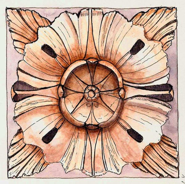 We’ve continued drawing them and I have been experimenting a bit with approaches to shading them. The process is teaching me quite a bit about watercolors and their use, at least the way I want to use them. Which one looks best to you?

I think they are all fabulous, if I must choose one, based on color alone, I’d choose the middle one, second choice would be the first darker one. How big are these squares?
The original mahogany squares were about 6″ square. The drawings are a bit smaller. Glad you like them.
I like the middle one too , warm colours
They’re all great but I prefer the middle one. It could be partially because of the design. I like seeing some of the background. I also see more levels of values in this one too.
Middle one too – I like the contrasts of the darks and lights.
Okay, I guess the middle one because of the lovely contrasts, but I’m still drawn to the top darker sketch. It really looks as though it’s jumped onto the page from real life.
It seems that the verdict is in. The ‘middle one’ is favored by most. Pat, I think the first one is closest to the actual carving. The color is different but the light/dark range is pretty close. I tried to maintain the color range but shifted the color away from the somewhere muddy brown of the first one. The third one tried to maintain the range but dull down the color somewhat. I think I failed as the darks aren’t dark enough. Live and learn. —- Larry